Tuesday, February 16, 2010

Ravine 1889 Vincent Van Gogh, Dutch, 1853–1890

73 x 91.7 cm (28 3/4 x 36 1/8 in.)
Oil on canvas

Van Gogh worked on this oil painting while at a asylum in the southern French town of Saint-Rémy.

This was the mountain ravine view near the asylum.

Whats interesting about this painting is there is another painting under the Ravine. It is speculated that Van Gogh had run out of canvas while waiting on a supply from his brother who was supplying his painting materials at the time. Van Goghs's use of shape, color, and brush strokes are a good example of Impressionism.


Wild Vegetation,
the drawing that corresponds
to
the hidden painting.


X-ray of Ravine,

revealing a different
painting underneath.


Monday, February 15, 2010

Rouen Cathedral, Façade - Claude Monet


This one of a series of paintings Monet did of the Rouen Cathedral in Rouen, France. Monet painted many different versions of the Facade due to his obsession with how light affected the object at different points of the day.

Monet painted this image with a lot of quick brush strokes. When up close you can see each individual brush mark with a particular color but when you step back all of the brush strokes blend together. The way the blues, yellows and whites blend together on the structure really convey the warmth and brightness of the sunlight at that particular moment.

This painting is a prime example of why Monet is one of the greatest impressionist. He uses just the right amount of abstract, in terms of colors and realism to give the viewer not only a visual representation but it also invokes a sense of feeling the sunlight on your back, as if you where there.

Wednesday, February 10, 2010

Henri Matisse's Carmelina

Image of: Carmelina

Henri Mattise's Carmelina is the picture that my partner and I chose to observe during our stay at the Museum of Fine Arts. The painting is extremely confrontational and almost uncomfortable to look at for too long as Carmelina stares back at your with upright posture and a somewhat blank expression. Most of the nude paintings I saw that day had the women painted with happy or seductive expressions on their faces, but this painting had an almost aggressive nature to it. As if to say, " Yes I'm naked, deal with it!". And yet the woman's expression is innocent at the same time, especially with the presence of the ribbon in her hair that contrasts with every other color in the painting. The woman's voluptuous body also contrast with the angular background which contains picture frames, a mirror, and what appear to be clay pots. This is really an incredible painting that evokes a lot of emotion and creates an atmosphere of intimacy instead of infatuation.


Old Kingdom Egypt


King Menkaure (Mycerinus) and queen
Egyptian, Old Kingdom, Dynasty 4, reign of Menkaure, 2490–2472 B.C.
Findspot: Giza, Egypt
Overall: 142.2 x 57.1 x 55.2 cm, 676.8 kg (56 x 22 1/2 x 21 3/4 in., 1492.1 lb.)
Block (Wooden skirts and two top): 53.3 x 180 x 179.7 cm (21 x 70 7/8 x 70 3/4 in.)
Greywacke

This sculpture signifies the ideal form of a man and a woman. When looking at this work of art the woman seems to be conveyed as being the strong individual this man ideal man needs. Her arms are holding him in place. That can be thought as maybe she does not want him to leave her or possible aggressiveness towards him. The male figure has his left leg bending in a stance. This can be viewed as he is protecting his woman or he is letting her know he leads there relationship and she follows. He is the dominant figure in that relationship. As they gaze out into emptiness I feel they are seeing what life would be like to be together for eternity.

Both figures do have similar resemblance. They both have the same face structure except the man has a nemes and her hair is pulled back of her ears. He has very proud shoulders showing his strength and she is reserved with her hand placed on his forearm. This sculpture is a great representation of what the royal Egyptians looked like.

JR

Monday, February 8, 2010

Double Portrait-Max Beckmann

The piece that I have chosen to write about is Max Beckmann's Double Portrait. At the museum we were assigned to analyze a painting with a partner so I felt that I got the most out of this painting since I was discussing it for a while. The piece did not immediately grab me but after studying it for a minute I realized that there was something about it I really liked. The first thing that really catches the viewer's attention is how the light plays with the senses. It is a dark piece but it is also very lit. The way Beckmann uses the candle to light the most important part of the painting, along with how he uses shadow, is truly remarkable. I usually take note when the artist uses the three primary colors which he does here in various ways. I feel this makes the painting more intense which really works for this piece. The detail in the lack of detail makes the painting very fascinating to look at since the simple is seamlessly combined with the complex. This creates a juxtaposition that could keep the viewer looking for hours. Although all of these are very special, I feel the crowning achievement of this painting are the faces of the two men. These faces are very unique in that it is hard for the viewer to grasp exactly what they are feeling. I would say they are both looking at the same thing, feeling similar, but not identical emotions. I cannot say what they are feeling though since I'm sure Beckmann's intention was not to deliberately give these men obvious emotions.

Slave Ship


This is Joseph Mallord William Turner's Slave Ship (Slavers Throwing Overboard the Dead and Dying, Typhoon Coming On). It was created in 1840.

It is based on a poem which is based on the true story of a slave ship which threw overboard dying slaves so that it could collect insurance money. More information about that at the MFA website.

This painting is definitely a departure from realism. The viewer can vaguely make out the figure of a ship and could make an educated guess at where the horizon is. However, the colors and forms that are to represent the waves look nothing realistically like the ocean. Rather, it looks like an angry mass ready to consume and destroy. Upon closer viewing, one can seen chains disappearing into this mass. It is unclear whether the sun is rising or setting. Instead of painting a clear representation of what the scene might realistically have looked like, Turner chose to paint what the scene might have emotionally or abstractly looked like.

CHARING CROSS BRIDGE, OVERCAST DAY

Claude Monet (1900)


"Paint what you really see, not what you think you ought to see; not the object isolated as in a test tube, but the object enveloped in sunlight and atmosphere, with the blue dome of Heaven reflected in the shadows" - Claude Monet

In Claude Monet's painting, Charing Cross Bridge, Overcast Day, we can see the sentiment that he provides in the above quote put to tremendous use. Despite the fog that encompasses the bridge on this particular cloudy day in 1900, glimmers of golden light reflect off the water, and a spectrum of blues and purples fill the canvas.

Monet painted this, along with many other views of the Charing Cross Bridge, during his stay in London at the turn of the 20th Century. He reflected principles of Impressionism by showering the bridge in different lights. Some of the skies have deep oranges and yellows in sunset, while others are green and turquoise in the morning light.

Arguably the most influential Impressionist, Monet also used visible brushstrokes, and strong feelings of movement to influence the tone of this piece, both of which as keystones in the Impressionist ideal.

By painting so many pieces of this particular bridge, he spotlighted something seemingly plain and ordinary, and made it art.

Ernst Ludwig Kirchner- Mountain Landscapes from Clavadel

"Kirchner suffered a complete mental and physical collapse after being called up for service during World War I; he then settled in Switzerland, hoping the mountain air would cure mind and body. He turned to painting the high Alps, with bold colors and coarse brushwork, suggesting man at peace with nature-an ideal that contrasted sharply with his own wartime experience."


I was first drawn to this picture because the colors in it are very vivid and stood out to me. The painting is a prime example of modernist art. The painting is clearly depicting a recognizable mountain landscape, but the artist has infused his own style and mental perspective into the work. Kirchner's landscapes are an idealized image of the beauty surrounding him. he found refuge in the mountains, and painted them as the beautiful sanctuary they represented to him. What I found interesting was that when you look closely at the painting, he did use the color black at all. Even at the darkest points of the painting, such as the houses and the standing figure's hair and body, he uses a deep blue rather than black. Also, he paints the tree trunks in a pinkish-purple hue, as opposed to the brown of the trees that occur in nature. This again plays into his idealistic view of the mountains, that brought him peace of mind and a comfort he craves.


Sunday, February 7, 2010

Two Nudes(Lovers), Oskar Kokoschka (1913)


Although this painting by Austrian expressionist painter, Oskar Kokoschka,
is named 'two nudes(lovers)',
it is filled with sadness and melancholy.
At first glance, it seems that man and woman are
dancing together, holding each other, but woman is
gazing into space with a vacant look as if she doesn't
notice his existence at all and one of man's eye is looking
to woman and another eye is looking to a viewer
with a sad face. We don't know what woman is gazing at all.
It is as if man is trying to keep woman from leaving.
It's lovers who are going into completely different directions. And man's sorrowful face and woman's expressionless cold face are very contrastive.

This painting is painted as self-portrait, but both of two
persons are very iconic and far from realistic depiction.
The background is also abstract with strong brushstrokes
in blue-gray color, it looks like brushstrokes form flower-
shape around two persons, but flowers are torn off and
ripped off. I feel that there is a contradiction of movement within this painting. By strong and violent brushstrokes around two persons, shaking and unstable feelings are expressed. On the other hand, these two persons are painted in a way of motionless like a very cold stone or sculpture.
In the distorted background, woman is taking a step forward. Her body, from her foot to her head, is painted almost in a straight line and in a center line. So focal point is not a man, but rather a woman, who is looking toward completely different direction from him.

In1913 that he painted this painting, he was in a romantic relationship with Alma Mahler,
who was a widow of the great Austrian composer Gustav Mahler. But their relationship
went worse and they were losing each other.
This painting is expressing his anxiety and bewilderness for his love, which lost its way.
After I considered this painting and knew the history, my heart ached with full of sadness...

Saturday, February 6, 2010


This painting by Édouard Manet is a political statement against modern barbarism, and especially against Napoleon III who at first imposed Maximilian as the emporor of mexico, but after the resistance he withdrew his forces out of Mexico.
Manet drew several versions of that painting. The second picture is another version of the same execution by Manet. It is very interesting to see how he decided to depict the executioners with more formal clothes, and in formal rows, making it look more calculated.
Choosing which side to take the painting also has a say in the painting. The third picture is of a print of the same execution done by Mejia Miramon, and was also published in 1867.
The forth example is Goya's 'The Third of May 1808', and it is a political statement regarding the Spanish resistance against Napoleon's great conquest.
It was very historically wise of Manet to use the same concept of sides (unlike the print on example 3). although there are a lot of similarities, it is very noticeable that Goya's painting is much more horrific, as if Manet was trying to keep Emperor Maximilian's dignity (and even the sense of a fatherly figure in the second painting).
The last picture is of a painting by Picasso, created much much later, in 1951, 'Massacre in Korea', where it is very clear that Picasso took the same concept and placed it in the fields of Korea with children and women on one side and robotic soldiers on the other.

Friday, February 5, 2010

Rue Gauguet by Nicolas Staël

The image above is a picture of Nicolas Staël's painting Rue Gauguet. Named after the street the artist's studio was on. One of the most important things to keep in mind while looking at this image above is that the original painting is much larger, 78 1/2 x 94 5/8 inches. Painted by the Russian artist in France. This painting is oil paint on wood panel and was painted in 1949.

This work is one of my favorites because it leaves the viewer with more questions after seeing it then it answers. What is it's subject? What is this piece telling me?

While looking at this work I was thinking about McCloud's idea of Realism to Abstraction and this work falls heavily on the Abstraction side. There are no elements in the work that resemble anything of the world outside of this painting. Another thing that is not as apparent in the image above is the amount of thick layers of manipulated paint there are on this surface. The most interesting part about looking at this painting for me was getting up close to see the textures and different tones and colors buried under the surface and in the separations between sections of color.

Thursday, February 4, 2010

The Pink Cloud of Antibes


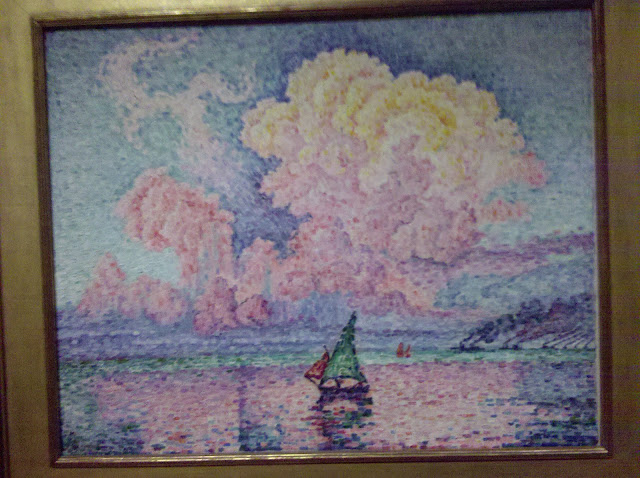
Painting:
Antibes, The Pink Cloud (1916)
Artist: Paul Signac

This was one of the many paintings at the Museum of Fine Arts that really caught my attention. Considered to be stylistically post-impressionism, this French artist draws the viewer in through an interesting use of brushstrokes to create an almost perfect balance between resemblance and abstraction. I first noticed the hundreds of small rectangular brushstrokes used to "thatch" together an image that is certainly distinguishable. A sail boat sits on a lake rendered unimportant by the very large pink cloud looming over what could be mountains in the background.

It's extremely important to note the use of color in the painting. At first glance, one might say that this is a fairly simple painting, and it is until you really study the complex relationship of colors. Each individual brushstroke plays an import role in shaping how the viewer perceives the image. The cloud is indeed pink (notice how it is carefully reflected by the lake and the distortion of the sail boat's own reflection in the water), but it is also many different shades of red, yellow, and orange. This could mean that the scene is set during a sunrise, making it a very peaceful and relaxed painting. However, the same use of color creates an interesting juxtaposition as the cloud appears to be emerging from the surface and not hanging from the sky. One could argue that the cloud is the result of some sort of explosion. Signac painted this in the year of 1916, two years after the start of World War I; on January 29th of that same year, Paris was bombed by German zeppelins. Perhaps this was the inspiration behind the painting and Signac was attempting to convey the delicate balance between life and death... beauty and disaster.

Going to the MFA


Today we have class at the Museum of Fine Arts, Boston. We'll take my superfast sprint through Western art history, using some of the concepts to which Scott McCloud has introduced us. And see with our own eyes some of the paintings that we have been analyzing through digitized projections in our classroom. Exciting all around.