Here is a video of my Project 2 title Turntable Improv.
Here is a video of my Project 1 called From A To D.
Thursday, April 29, 2010
Wednesday, April 21, 2010
3D filming
Avatar has changed the way sci-fi films are created. James Cameroon posponed the making of Avatar due to the lack of technology available to create what he had planned. For years himself and his colleague's development a new 3D camera.

The picture above is that camera. It was based around how the human eyes work. Originally 3D pictures where filmed using two camera's placed at an angle to one another and then the two images where imposed over one another. However the outcome was often crude and didn't really draw the viewer in.
James Cameron changed 3D filming by developing a camera that had the two lenses positioned next to one another, like a pair of eyes. The lenses where positioned with one slightly infront of the other and the images where transmitted from the camera to a super-computer that would then render the images, giving a 3D film.
The development of this technology now means that tv shows, sports events, concerts etc. can now be broadcast in 3D around the world and viewed at 3D cinema screens and soon t.v's in your own room.
Art in Virtual Worlds


This week we'll take a look at and, if you want, go into the virtual world Second Life to see the kinds of immersive, interactive virtual art that can be made and experienced there. Today, I'll give you an overview of SL and virtual subjectivity (which has been the main topic I've been exploring through machinima, virtual art, and writing), and tomorrow you'll have the opportunity to learn how to build a 3d sculpture in SL in a workshop session, and then we'll visit some art installations.
Here are some screen shots of the new Welcome Island where you can learn the 6 most essential things you'll need to get around in SL.
Thursday, April 15, 2010
Internet Dating
With more and more advances in the field of social networking, it would only be natural that internet dating would become more and more popular. According to projected numbers, Americans will spend $932 million dollars on internet dating services. The stigmatism formerly associated with internet dating is no longer there and it is now seen as a legitmate way to meet the love of your life. While there are plenty of success stories with dating services, there is a long list of problems with concept as a whole.
1. Since people normally engage in several emails back and forth before they actually meet, it is very easy to lie and keep a lie going without getting caught. People create multiple personalities online and are easily able to scam others on the site. A recent study showed that women assume a false degree of safety with internet dating that can lead to some horrific situations.
2. These sites can be very unbalanced gender wise with males usually dominating the playign field. A balance in age can also be a problems as many of the women who use these sites can be older.
3. Gays and transgender people have accused several sites of discrimination. Most site's profile builders do not have ways to indicate bisexuality, homosexuality, or transgenderism.
4. Problems with these sites often go unreported due to feelings of humiliation. Many terrible acts of sexual violence and rape go unreported from internet dating users. People are too embarrassed to admit what happened and will not make a report on their abuse. Not all sites do background checks on their users, and sexual predators are still able to get by these securities.
5. Users will still appear on a site even if they have no accessed their account for years, making it appear that more people are using the site than what is actually going on.
With the busy lifestyles that many people lead, it can be hard to find time to find love. Internet dating is supposed to be the answer to this so that you can "date" from your home without having to go out. The emailing process is designed so that you can quickly find matches and not waste your time with people that you know you will not get along with. While these are all good ideas for our modern world, I do not think that internet dating is a valid replacement for acutal in person dating. People decide if they are attracted to someone within the first 5 minutes of talking to them in person. No matter how many emails you send to someone, you never know if you will actually be attracted to them. Pharamones are a very important part of human attraction, and without really encountering them from another person, you will never know if there is a true sexual attraction with someone.
Tuesday, April 13, 2010
3DTV

Starting in June 2010, DirecTV will premiere four channels dedicated to 3D programming. They will include ESPN 3D, a 3D-only channel called N3D, a 3D pay-per view channel, and a 3D DirecTV on Demand. ESPN 3D is a free upgrade for ESPN-subscribing DirecTV members, while the rest of the channels are free upgrades for all DirecTV subscribers.
Discovery Channel has also announced plans to launch a 3D channel in 2011, as a cooperation with IMAX and Sony.
The world's fascination with 3D stems from our want to have fiction be as realistic as possible, thus allowing us to believe it. The technology has been around for over 50 years and shows no signs of slowing, only growth.
The fact that two 3D movies were on the list of Best Picture nominations at the 2009 Academy Awards shows that it is becoming more and more mainstream to have 3D in our everyday life. Why wouldn't the next step be the screen in each of our homes?
In the future, I could likely see all channels broadcasting in 3D, as long as they find a technology to allow us not to wear those stupid looking glasses.
Monday, April 12, 2010
Ten Questions to Ask about Technology
 Here are Ten Questions (ok there are more, because some questions are kind of nested) to ask about a new technology tool that help us think about it in its wider cultural context. I am working off of, as usual, Cultural Studies founder Stuart Hall's idea of the circuit of culture, in which production, consumption, regulation, representation, and identity are all mutually informing. When we combine this with the historical trajectory perspective I am always harping on--which puts any given cultural text (game, device, app, film, dvd menu, etc) in a lineage of antecedents, looks for its peak if it has had it yet, and then speculates wildly on what might come next--we will always have a lot to talk about when we talk about any new aspect of technology, beyond the thumbs up/thumbs down reaction from which we might start and then come back to at the end, perhaps more thoughtfully.
 Ten questions to ask about a new technology:
1) What is its purpose?
2) What was its analog, if there was one? How does a mediated, digital, or networked version of the tool or technique change it?
3) Who uses it? How? When? Where? Why? Does the use change over time? Do different users use it differently?
4) How does a user learn how to use it?
5) Who makes it? Who profits? How?
6) How is it regulated?
7) How does it spread?
8) Does it create or fill a need?
9) What is the interface? Is it also an object? Or a practice? Both? (think cell phone)
10) How does the user change the technology as he or she uses it? (mods and hacks and appropriations) How does the technology change the user? How does it become part of a person's sense of self?
Sunday, April 4, 2010
The Wikinovel - Collaborative Fiction
... offers a way for people from all over the world to interact within the experience of collaborative literature. Users, with or without literary training/knowledge, may create a work of literature (be it fiction, poetry, etc) with other users in an organized, online environment.

The first organized attempt at writing a collaborative wikinovel was sponsored by Penguin Publishing and De Montfort University and was called A Million Penguins. The final product was not considered to be a novel and the experience was eventually regarded as an interesting interaction/performance rather than anything that could produce a good resulting product. Whether the concept of a wikinovel will be able to produce well respected literature or not remains to be seen.
Here are some links to collaborative literature websites...
... and for more INFO
Friday, April 2, 2010
Google Earth 5.0
Google Earth 5.0 Offers people a new way to explore right from their home computer. New features of Google Earth are:
Moon Exploration
Mars Exploration
Sea Exploration
Allowing you to Record your tour to share it.

Also, updated Earth features include 3D buildings and street views and historic tracking that allows you to see the change of ares over time.
Thursday, April 1, 2010
Sumo Paint

 The primary purpose of the community is to create, share, remix, explore, comment, rate and fave the artwork of its members. The purpose of the community is to create, share, explore, comment, rate the artwork of its members.
Sumo targets to expand Sumo offering to be one of the most popular web services and the leading creative brand of the next decade. as you can see above I used sumo paint to edit one of my own photos. the steps I used in the program to get the picture like this are really user friendly. heres a list of what I used: bump map, equalize colors, negative, perspective tiling, offset, add layer, paint bucket fill, brightness / contrast, add new layer, add lighting effects. I will explain how it all works on Monday. :)
Soundcloud: a new way to share music

Soundcloud.com is a website dedicated for Artists, Producers, Promoters, DJ's and Labels to receive, send and distribute music in an easy and legal way.
Signing up is free and very easy. Once a member you can upload your tracks to your personal page and make settings on how the world can hear your music. You can make it available for download or not, allow other members to make time lined comments on your music, upload a track image, write a description and add a genre.
Here is a picture of my page...

I get statistic info about how many people look at my page and how many times my music has been played. There is also a cool looking player that has the waveform of the music your listening to and others can make a comment right at the moment of the song they are commenting on.
I also get updated on new music from other artists I like and when I upload something new people will get a news feed style look at my latest work.
There is also a widget player that you can embed in your own personal site or on other blogs...

When uploading your new work you can chose how you would like to license it. You can reserve all rights or you can place it in creative commons and chose what others can do with your work.
This is a great way to share music with others privately by making new work only accessible to certain users. Since it is just a steaming player people never actually download the material to hear it making it legal and safe from normal piracy.
So go sign up at www.soundcloud.com

Wednesday, March 31, 2010
Uniqlock
Uniqlock is a blog part which is made by Uniqlo, Japanese
clothing retail chain.
The company also has stores in the U.S.(New York),
the U.K., France, Hong Kong, Singapore, China and South Korea.
It is a blog part and it's a clock with music and video of girls
who wear Uniqlo's clothing and dance around all over the world.
Anyone in the world can put this blog part in their own blog.
Electronic music based on the ticking of the clock and dancing
girls video never stops, so one cannot stop watching it once she/he
starts to watch.
What is interesting about this blog part is that it never says
"Watch this" or "Buy this", but it naturally attracts people
with the power of music, dance and all beautiful monuments
in the world. Even if Uniqlo is a clothing retail store, but it
doesn't advertise any clothing here.
And What is important thing about this blog part is that it is
the viewer who choose and decide to put it on their blog.
It means that the viewer itself is going to be an advertiser by
putting it.
And other people who looked this blog part on someone's blog
can download it and put it.
More than 34,000 people over 85 countries put this blog
on their blogs!
Touch Yourself Technology?
Physical interfaces only get in the way and become one extra thing people need to worry about carrying around or losing. Just as wired electronics are fading away into the history books, so will objects used to control electronic devices (keyboards, TV remotes, video game controllers, etc.) You might be thinking, "Well, keyboards are already on their way out with the iPad and other touch screen devices, so what else is new?" This is true; touch screens are the new interface of choice for many people worldwide. The track pad on your MacBook Pro is a combination of touch screen technology and gesture recognition technology as it already recognizes a variety of finger gestures, such as the pinch and rotate gestures. However, they too will eventually make their way into the pages of the history books with the current interest in developing "gesture" recognition technology. Thus, the concept behind human based interfaces and technology that is currently being developed by several separate parties. Who will come out on top?
Microsoft in collaboration with the University of Washington and the University of Toronto have begun spending some serious time and money developing muscle gesture technology for use with the Microsoft Surface (which is essentially a giant interactive touch screen.) This allows users of MS Surface to use variables such as pressure and gestures to fulfill different commands in the program. The technology also identifies which fingers are being used and will respond accordingly by assigning say different colors to each finger, allowing the user to finger paint a digital masterpiece.
Continuing development, Microsoft explored Forearm Electromyography (EMG) to take the physical interface out of the scenario. Although wired, Microsoft is currently looking into a wireless armband approach using EMG to track muscle movement where no physical device is present allowing one to unlock the trunk of a car while their hands are full. (For this and other examples of Microsoft's EMG technology, see the video below from 0:58-2:16.)
After further development, it isn't difficult to foresee this kind of hands-on technology becoming smaller, inconspicuous, and perhaps even fashionable to wear. It may even become universally compatible with most electronic devices. No one will ever have to worry about dropping their iPod or their cell phone again, as they can be left in your backpack with your books and lunch, and those precious touch screens won't be accidentally broken or cracked. However, even if they are, Skinput allows the functionality of those devices to remain... on your arm.
-Shaun B.
Microsoft in collaboration with the University of Washington and the University of Toronto have begun spending some serious time and money developing muscle gesture technology for use with the Microsoft Surface (which is essentially a giant interactive touch screen.) This allows users of MS Surface to use variables such as pressure and gestures to fulfill different commands in the program. The technology also identifies which fingers are being used and will respond accordingly by assigning say different colors to each finger, allowing the user to finger paint a digital masterpiece.
Continuing development, Microsoft explored Forearm Electromyography (EMG) to take the physical interface out of the scenario. Although wired, Microsoft is currently looking into a wireless armband approach using EMG to track muscle movement where no physical device is present allowing one to unlock the trunk of a car while their hands are full. (For this and other examples of Microsoft's EMG technology, see the video below from 0:58-2:16.)
EMG muscle recognition is only one direction the future of electronics may head. The other is what is known as "Skinput." Chris Harrison at Carnegie Mellon's Human Computer Interaction Institute developed his own system similar in idea to the EMG system used by Microsoft, however unique in method. His system actually measures the acoustics of the human body and converts contact into commands that may control a number of electronic devices. (See 0:40-:056 of the blow video.) By using a monitor placed in an arm band (image to the right), Skinput calculates acoustic variables such as bone density and location to dictate commands to a specific device.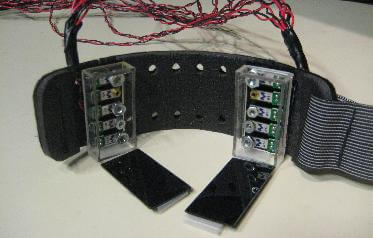
With the use of a fairly small pico projector, a visible digital interface can be... well... projected onto the user's forearm. (See 2:07-3:05 of the below video.) Skinput combines hand gestures commonly used to in a completely new and exciting way. Depending on where on the user's fingers, palm, wrist or forearm is tapped, one can easily scroll through a list of their favorite musical artists, skip songs being played back, dial phone calls, or play video games right on one's hand using gestures such as taps, pinches, or flicks with the fingers.After further development, it isn't difficult to foresee this kind of hands-on technology becoming smaller, inconspicuous, and perhaps even fashionable to wear. It may even become universally compatible with most electronic devices. No one will ever have to worry about dropping their iPod or their cell phone again, as they can be left in your backpack with your books and lunch, and those precious touch screens won't be accidentally broken or cracked. However, even if they are, Skinput allows the functionality of those devices to remain... on your arm.
-Shaun B.
Tuesday, March 30, 2010
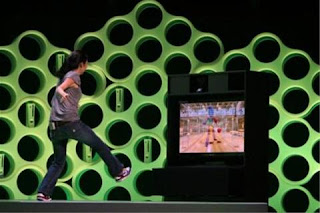
Project Natal - The human video game controller
Fact be told, there is no better way to describe how amazing this new product is, then by watching their video demo... http://www.xbox.com/en-US/live/projectnatal/
BUT...
 Project Natal is a new product that's about to come out by the end of this year (to be honest, that's what they said last year and I'm not sure they're on schedule for this year too...).
It is a new way to control your home game console (Xbox 360 only) without any remote control, or in another words, with you as a remote control.
As Spielberg described it "a technology that recognizes not only your thumbs and your wrists, but your entire being".
What he refers to by that is not only your entire body.
Microsoft also made a very impressive voice recognition system to work with that product as well.
The video recognition system they built not only recognizes movements on the screen, it is capable to analyze your body and to distinguish between hands and legs, and can recognize your face in comparison to other people on the screen and tell them apart and give them different avatar on the screen.
All of that is done by a very advanced face and body recognition software, 2 small cameras to be able to get 3d movement around the room and a special sensor that is able to map the room.
The software itself functions with a standard gesture control, that recognizes specific movements and translates them to software functions.
Does this look like a new and awesome technology?
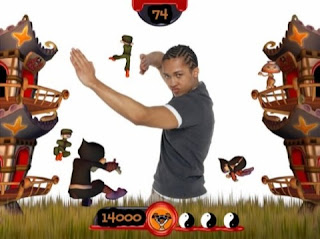 And how about this game?
Unfortunately for Microsoft, the second image is from a game almost ten years old, made by sony for PS2 with EyeToy.
EyeToy is another product with video recognition ability.
True, it is not as sophisticated as what Microsoft is working on, but MS are obviously not the pioneers in that field.
In fact, ever since webcams became commercial, in 1991, games using motion sensors started popping up. for example bouncing a ball on the screen, or wiping a screen from "dirt".
So Microsoft are doing the same (and still genius) trick, of taking several technologies already created, and combining them together into one awesome product. (that's how MS-DOS and the first Windows came out, and the feature of multi-tasking).
I have several future predictions, for the near and far future.
First thing, it is true that the controller is limiting our control over the game console.
but, as the thumbs bother us to go above and beyond our imagination, our body also does none the less. especially for people who are not in shape and have absolutely no aspiration for it (which makes too much of earths population\gamer population to me).
As we speak, Emotiv is working on the development of a mind reader controller that works with brain waves.
 As the progress of this company goes, it seems the product is still far from fully functional (but it definitely looks cool!!).
And for the even more distant future -

Holodeck!
not very original, I know, and very star-trek geeky of me to post that picture, but it still makes me wonder how it would be to get into a dark room, and to command it to start, and then suddenly I'm in the desert with sand at my feet.
looking around I see nothing but sand, the warm sun camels with their owners wondering around in the distance ----- and the metallic door from which I came in from... :)
Cheers,
DP
BUT...
 Project Natal is a new product that's about to come out by the end of this year (to be honest, that's what they said last year and I'm not sure they're on schedule for this year too...).
It is a new way to control your home game console (Xbox 360 only) without any remote control, or in another words, with you as a remote control.
As Spielberg described it "a technology that recognizes not only your thumbs and your wrists, but your entire being".
What he refers to by that is not only your entire body.
Microsoft also made a very impressive voice recognition system to work with that product as well.
The video recognition system they built not only recognizes movements on the screen, it is capable to analyze your body and to distinguish between hands and legs, and can recognize your face in comparison to other people on the screen and tell them apart and give them different avatar on the screen.
All of that is done by a very advanced face and body recognition software, 2 small cameras to be able to get 3d movement around the room and a special sensor that is able to map the room.
The software itself functions with a standard gesture control, that recognizes specific movements and translates them to software functions.

Does this look like a new and awesome technology?
 And how about this game?
Unfortunately for Microsoft, the second image is from a game almost ten years old, made by sony for PS2 with EyeToy.
EyeToy is another product with video recognition ability.
True, it is not as sophisticated as what Microsoft is working on, but MS are obviously not the pioneers in that field.
In fact, ever since webcams became commercial, in 1991, games using motion sensors started popping up. for example bouncing a ball on the screen, or wiping a screen from "dirt".
So Microsoft are doing the same (and still genius) trick, of taking several technologies already created, and combining them together into one awesome product. (that's how MS-DOS and the first Windows came out, and the feature of multi-tasking).
I have several future predictions, for the near and far future.
First thing, it is true that the controller is limiting our control over the game console.
but, as the thumbs bother us to go above and beyond our imagination, our body also does none the less. especially for people who are not in shape and have absolutely no aspiration for it (which makes too much of earths population\gamer population to me).
As we speak, Emotiv is working on the development of a mind reader controller that works with brain waves.
 As the progress of this company goes, it seems the product is still far from fully functional (but it definitely looks cool!!).
And for the even more distant future -

Holodeck!
not very original, I know, and very star-trek geeky of me to post that picture, but it still makes me wonder how it would be to get into a dark room, and to command it to start, and then suddenly I'm in the desert with sand at my feet.
looking around I see nothing but sand, the warm sun camels with their owners wondering around in the distance ----- and the metallic door from which I came in from... :)
Cheers,
DP
Sunday, March 7, 2010
Digital Transformations
These are notes on my essay, "Digital Transformations: The Media Is the Mix" in m/c journal, which we'll be discussing as we talk about Mike Figgis's film Timecode.
Key concepts: digital cinema (as defined by Manovich), agency and & linearity (graph interpretation of Murray), mix.
Tuesday, February 16, 2010
 Ravine 1889 Vincent Van Gogh, Dutch, 1853–1890
73 x 91.7 cm (28 3/4 x 36 1/8 in.)
Oil on canvas
Van Gogh worked on this oil painting while at a asylum in the southern French town of Saint-Rémy.
This was the mountain ravine view near the asylum.
Whats interesting about this painting is there is another painting under the Ravine. It is speculated that Van Gogh had run out of canvas while waiting on a supply from his brother who was supplying his painting materials at the time. Van Goghs's use of shape, color, and brush strokes are a good example of Impressionism.
Wild Vegetation,
the drawing that corresponds
to the hidden painting.


X-ray of Ravine,
revealing a different
painting underneath.
Monday, February 15, 2010
Rouen Cathedral, Façade - Claude Monet

This one of a series of paintings Monet did of the Rouen Cathedral in Rouen, France. Monet painted many different versions of the Facade due to his obsession with how light affected the object at different points of the day.
Monet painted this image with a lot of quick brush strokes. When up close you can see each individual brush mark with a particular color but when you step back all of the brush strokes blend together. The way the blues, yellows and whites blend together on the structure really convey the warmth and brightness of the sunlight at that particular moment.
This painting is a prime example of why Monet is one of the greatest impressionist. He uses just the right amount of abstract, in terms of colors and realism to give the viewer not only a visual representation but it also invokes a sense of feeling the sunlight on your back, as if you where there.
Wednesday, February 10, 2010
Henri Matisse's Carmelina
Henri Mattise's Carmelina is the picture that my partner and I chose to observe during our stay at the Museum of Fine Arts. The painting is extremely confrontational and almost uncomfortable to look at for too long as Carmelina stares back at your with upright posture and a somewhat blank expression. Most of the nude paintings I saw that day had the women painted with happy or seductive expressions on their faces, but this painting had an almost aggressive nature to it. As if to say, " Yes I'm naked, deal with it!". And yet the woman's expression is innocent at the same time, especially with the presence of the ribbon in her hair that contrasts with every other color in the painting. The woman's voluptuous body also contrast with the angular background which contains picture frames, a mirror, and what appear to be clay pots. This is really an incredible painting that evokes a lot of emotion and creates an atmosphere of intimacy instead of infatuation.
Old Kingdom Egypt

King Menkaure (Mycerinus) and queen
Egyptian, Old Kingdom, Dynasty 4, reign of Menkaure, 2490–2472 B.C.
Findspot: Giza, Egypt
Overall: 142.2 x 57.1 x 55.2 cm, 676.8 kg (56 x 22 1/2 x 21 3/4 in., 1492.1 lb.)
Block (Wooden skirts and two top): 53.3 x 180 x 179.7 cm (21 x 70 7/8 x 70 3/4 in.)
Greywacke
This sculpture signifies the ideal form of a man and a woman. When looking at this work of art the woman seems to be conveyed as being the strong individual this man ideal man needs. Her arms are holding him in place. That can be thought as maybe she does not want him to leave her or possible aggressiveness towards him. The male figure has his left leg bending in a stance. This can be viewed as he is protecting his woman or he is letting her know he leads there relationship and she follows. He is the dominant figure in that relationship. As they gaze out into emptiness I feel they are seeing what life would be like to be together for eternity.
Both figures do have similar resemblance. They both have the same face structure except the man has a nemes and her hair is pulled back of her ears. He has very proud shoulders showing his strength and she is reserved with her hand placed on his forearm. This sculpture is a great representation of what the royal Egyptians looked like.
JR
Monday, February 8, 2010
Double Portrait-Max Beckmann
The piece that I have chosen to write about is Max Beckmann's Double Portrait. At the museum we were assigned to analyze a painting with a partner so I felt that I got the most out of this painting since I was discussing it for a while. The piece did not immediately grab me but after studying it for a minute I realized that there was something about it I really liked. The first thing that really catches the viewer's attention is how the light plays with the senses. It is a dark piece but it is also very lit. The way Beckmann uses the candle to light the most important part of the painting, along with how he uses shadow, is truly remarkable. I usually take note when the artist uses the three primary colors which he does here in various ways. I feel this makes the painting more intense which really works for this piece. The detail in the lack of detail makes the painting very fascinating to look at since the simple is seamlessly combined with the complex. This creates a juxtaposition that could keep the viewer looking for hours. Although all of these are very special, I feel the crowning achievement of this painting are the faces of the two men. These faces are very unique in that it is hard for the viewer to grasp exactly what they are feeling. I would say they are both looking at the same thing, feeling similar, but not identical emotions. I cannot say what they are feeling though since I'm sure Beckmann's intention was not to deliberately give these men obvious emotions.
Slave Ship
This is Joseph Mallord William Turner's Slave Ship (Slavers Throwing Overboard the Dead and Dying, Typhoon Coming On). It was created in 1840.
It is based on a poem which is based on the true story of a slave ship which threw overboard dying slaves so that it could collect insurance money. More information about that at the MFA website.
This painting is definitely a departure from realism. The viewer can vaguely make out the figure of a ship and could make an educated guess at where the horizon is. However, the colors and forms that are to represent the waves look nothing realistically like the ocean. Rather, it looks like an angry mass ready to consume and destroy. Upon closer viewing, one can seen chains disappearing into this mass. It is unclear whether the sun is rising or setting. Instead of painting a clear representation of what the scene might realistically have looked like, Turner chose to paint what the scene might have emotionally or abstractly looked like.
CHARING CROSS BRIDGE, OVERCAST DAY
Claude Monet (1900)

"Paint what you really see, not what you think you ought to see; not the object isolated as in a test tube, but the object enveloped in sunlight and atmosphere, with the blue dome of Heaven reflected in the shadows" - Claude Monet
In Claude Monet's painting, Charing Cross Bridge, Overcast Day, we can see the sentiment that he provides in the above quote put to tremendous use. Despite the fog that encompasses the bridge on this particular cloudy day in 1900, glimmers of golden light reflect off the water, and a spectrum of blues and purples fill the canvas.
Monet painted this, along with many other views of the Charing Cross Bridge, during his stay in London at the turn of the 20th Century. He reflected principles of Impressionism by showering the bridge in different lights. Some of the skies have deep oranges and yellows in sunset, while others are green and turquoise in the morning light.
Arguably the most influential Impressionist, Monet also used visible brushstrokes, and strong feelings of movement to influence the tone of this piece, both of which as keystones in the Impressionist ideal.
By painting so many pieces of this particular bridge, he spotlighted something seemingly plain and ordinary, and made it art.
Ernst Ludwig Kirchner- Mountain Landscapes from Clavadel

"Kirchner suffered a complete mental and physical collapse after being called up for service during World War I; he then settled in Switzerland, hoping the mountain air would cure mind and body. He turned to painting the high Alps, with bold colors and coarse brushwork, suggesting man at peace with nature-an ideal that contrasted sharply with his own wartime experience."
I was first drawn to this picture because the colors in it are very vivid and stood out to me. The painting is a prime example of modernist art. The painting is clearly depicting a recognizable mountain landscape, but the artist has infused his own style and mental perspective into the work. Kirchner's landscapes are an idealized image of the beauty surrounding him. he found refuge in the mountains, and painted them as the beautiful sanctuary they represented to him. What I found interesting was that when you look closely at the painting, he did use the color black at all. Even at the darkest points of the painting, such as the houses and the standing figure's hair and body, he uses a deep blue rather than black. Also, he paints the tree trunks in a pinkish-purple hue, as opposed to the brown of the trees that occur in nature. This again plays into his idealistic view of the mountains, that brought him peace of mind and a comfort he craves.
Sunday, February 7, 2010
Two Nudes(Lovers), Oskar Kokoschka (1913)
 Although this painting by Austrian expressionist painter, Oskar Kokoschka,
 is named 'two nudes(lovers)',
it is filled with sadness and melancholy.
At first glance, it seems that man and woman are
dancing together, holding each other, but woman is
gazing into space with a vacant look as if she doesn't
notice his existence at all and one of man's eye is looking
to woman and another eye is looking to a viewer
with a sad face. We don't know what woman is gazing at all.
It is as if man is trying to keep woman from leaving.
It's lovers who are going into completely different directions. And man's sorrowful face and woman's expressionless cold face are very contrastive.
This painting is painted as self-portrait, but both of two
persons are very iconic and far from realistic depiction.
The background is also abstract with strong brushstrokes
in blue-gray color, it looks like brushstrokes form flower-
shape around two persons, but flowers are torn off and
ripped off. I feel that there is a contradiction of movement within this painting. By strong and violent brushstrokes around two persons, shaking and unstable feelings are expressed. On the other hand, these two persons are painted in a way of motionless like a very cold stone or sculpture.
In the distorted background, woman is taking a step forward. Her body, from her foot to her head, is painted almost in a straight line and in a center line. So focal point is not a man, but rather a woman, who is looking toward completely different direction from him.
In1913 that he painted this painting, he was in a romantic relationship with Alma Mahler,
who was a widow of the great Austrian composer Gustav Mahler. But their relationship
went worse and they were losing each other.
This painting is expressing his anxiety and bewilderness for his love, which lost its way.
After I considered this painting and knew the history, my heart ached with full of sadness...
Saturday, February 6, 2010


This painting by Édouard Manet is a political statement against modern barbarism, and especially against Napoleon III who at first imposed Maximilian as the emporor of mexico, but after the resistance he withdrew his forces out of Mexico.
Manet drew several versions of that painting. The second picture is another version of the same execution by Manet. It is very interesting to see how he decided to depict the executioners with more formal clothes, and in formal rows, making it look more calculated.
Choosing which side to take the painting also has a say in the painting. The third picture is of a print of the same execution done by Mejia Miramon, and was also published in 1867.
The forth example is Goya's 'The Third of May 1808', and it is a political statement regarding the Spanish resistance against Napoleon's great conquest.
It was very historically wise of Manet to use the same concept of sides (unlike the print on example 3). although there are a lot of similarities, it is very noticeable that Goya's painting is much more horrific, as if Manet was trying to keep Emperor Maximilian's dignity (and even the sense of a fatherly figure in the second painting).
The last picture is of a painting by Picasso, created much much later, in 1951, 'Massacre in Korea', where it is very clear that Picasso took the same concept and placed it in the fields of Korea with children and women on one side and robotic soldiers on the other.

Friday, February 5, 2010
Rue Gauguet by Nicolas Staël
 The image above is a picture of Nicolas Staël's painting Rue Gauguet. Named after the street the artist's studio was on. One of the most important things to keep in mind while looking at this image above is that the original painting is much larger, 78 1/2 x 94 5/8 inches. Painted by the Russian artist in France. This painting is oil paint on wood panel and was painted in 1949.
This work is one of my favorites because it leaves the viewer with more questions after seeing it then it answers. What is it's subject? What is this piece telling me?
While looking at this work I was thinking about McCloud's idea of Realism to Abstraction and this work falls heavily on the Abstraction side. There are no elements in the work that resemble anything of the world outside of this painting. Another thing that is not as apparent in the image above is the amount of thick layers of manipulated paint there are on this surface. The most interesting part about looking at this painting for me was getting up close to see the textures and different tones and colors buried under the surface and in the separations between sections of color.
Thursday, February 4, 2010
The Pink Cloud of Antibes
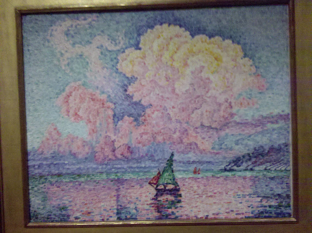
Painting: Antibes, The Pink Cloud (1916)
Artist: Paul Signac
This was one of the many paintings at the Museum of Fine Arts that really caught my attention. Considered to be stylistically post-impressionism, this French artist draws the viewer in through an interesting use of brushstrokes to create an almost perfect balance between resemblance and abstraction. I first noticed the hundreds of small rectangular brushstrokes used to "thatch" together an image that is certainly distinguishable. A sail boat sits on a lake rendered unimportant by the very large pink cloud looming over what could be mountains in the background.
It's extremely important to note the use of color in the painting. At first glance, one might say that this is a fairly simple painting, and it is until you really study the complex relationship of colors. Each individual brushstroke plays an import role in shaping how the viewer perceives the image. The cloud is indeed pink (notice how it is carefully reflected by the lake and the distortion of the sail boat's own reflection in the water), but it is also many different shades of red, yellow, and orange. This could mean that the scene is set during a sunrise, making it a very peaceful and relaxed painting. However, the same use of color creates an interesting juxtaposition as the cloud appears to be emerging from the surface and not hanging from the sky. One could argue that the cloud is the result of some sort of explosion. Signac painted this in the year of 1916, two years after the start of World War I; on January 29th of that same year, Paris was bombed by German zeppelins. Perhaps this was the inspiration behind the painting and Signac was attempting to convey the delicate balance between life and death... beauty and disaster.
Going to the MFA

Today we have class at the Museum of Fine Arts, Boston. We'll take my superfast sprint through Western art history, using some of the concepts to which Scott McCloud has introduced us. And see with our own eyes some of the paintings that we have been analyzing through digitized projections in our classroom. Exciting all around.
Tuesday, January 12, 2010
Welcome to VisCult Spring 2010
This is the blog for Approaches to Visual Culture at Berklee College of Music for Spring 2010.
Subscribe to:
Comments (Atom)